
THE IREKA
GROUP

Founded in 1967, Ireka Corporation Berhad began its business as a small earthworks contractor for large open cast tin mines and construction. In the 1980s, it emerged as one of the largest local earthwork contractors in Malaysia. Throughout the 1990s and early 2000s, it constructed some of the country’s most notable infrastructure projects including civil engineering, building and public utilities.. The Company was listed on the Second Board of Bursa Malaysia on 12 July 1993, and transferred to the Main Market on 13 June 2002. Today, the Group’s activities are divided into four businesses:
Property Development
Construction
Technologies
Energy & Utilities
VISION
To be a progressive and globally-focused corporation which prides itself on proven track record in performance reliability, excellence in quality and creativity in all products and services offered
BRAND PROMISE
We promise to create value in all that we do, be it tangible or otherwise.
BRAND VALUES
Integrity , Visionary, Entrepreneurial
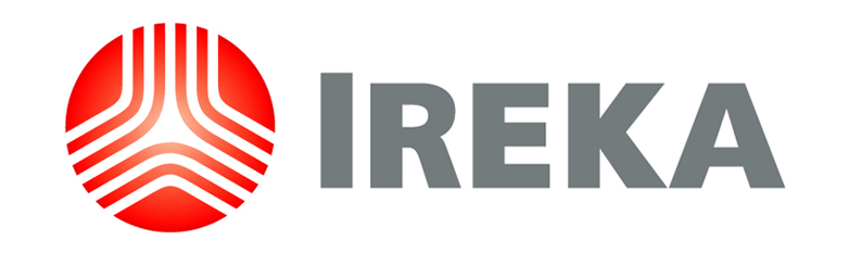
THE IREKA LOGO
LOGO MARK
The lines that flow down the circle symbolise the company’s association with highway construction, while the two lines at the base represent tree roots that are firmly embedded in solid ground, signifying Ireka’s firm foundation. The glow in the heart of the logo embodies Ireka’s visionary strength at the core of its business.
LOGO TYPE
Ireka’s logotype is a modified version of Frutiger, which is in Sans Serif to signify modernity.
COLOURS
Ireka’s corporate colours of red and grey reflect the company’s brand personality: red to signify energy and grey to represent their traits of quiet elegance and being uncomplicated and transparent. Together, they collaborate to portray Ireka’s brand values – integrity, visionary and entrepreneurial.